Website Development
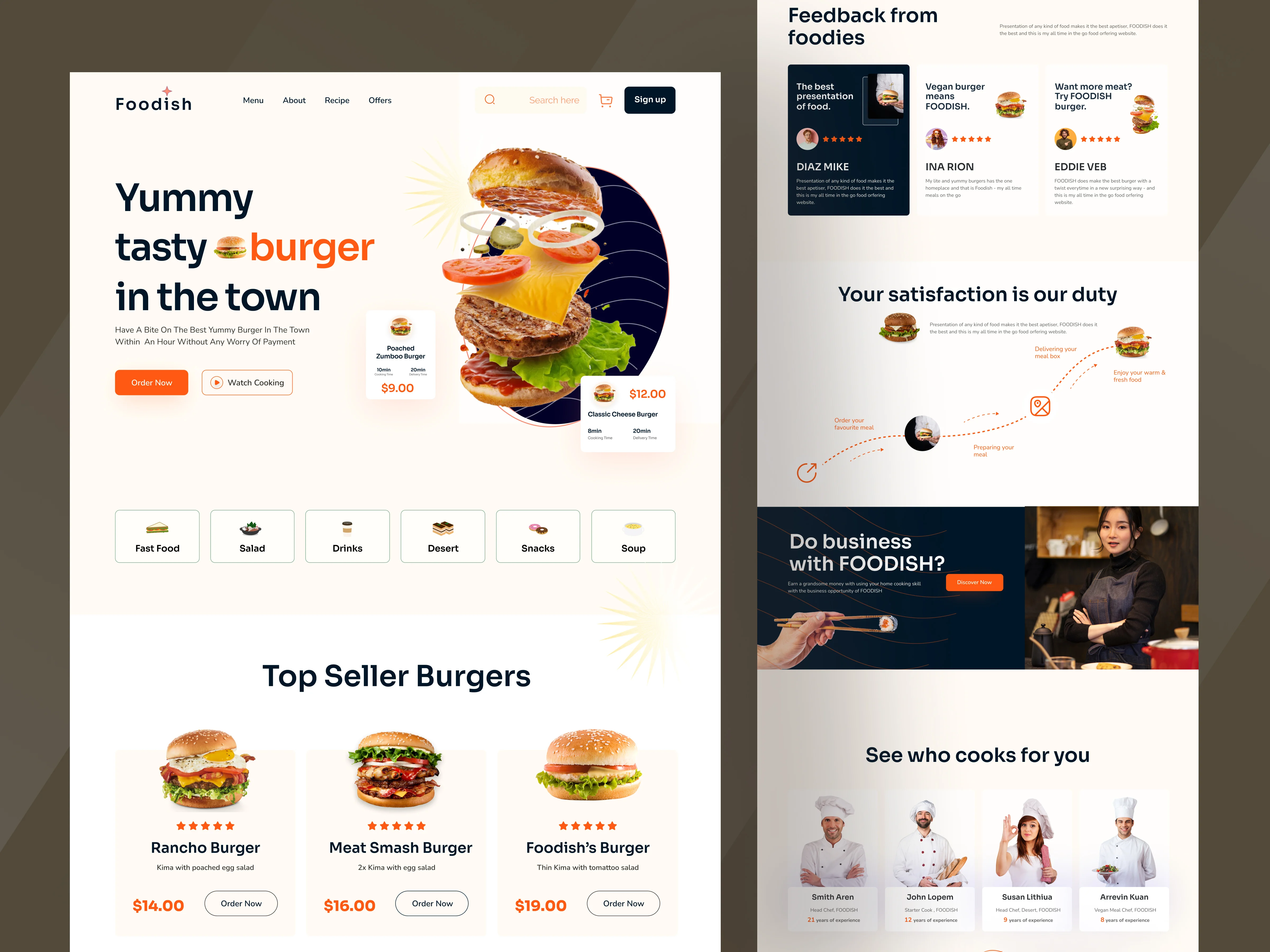
A High-Converting Food Ordering Website 🍔
A clean, modern website designed to instantly grab attention, showcase delicious meals, and drive more online orders.
🚀 Project Overview
The brand had great food, but the website failed to create cravings or drive action. Visitors were coming in—but not ordering.
We solved this by creating a bold, visually irresistible experience that guides users from hunger → action seamlessly.
⚡ The Problem
❌ Not visually appealing or mouth-watering
❌ No clear order flow
❌ Weak call-to-action (CTA)
❌ Low engagement & conversions
👉 People visited… but didn’t convert.
✨ The Solution
We designed a high-converting food website that:
🍔 Uses big, eye-catching food visuals to trigger cravings
⚡ Adds clear & simple “Order Now” buttons for fast action
🧭 Ensures smooth navigation with clean categories & menu
⭐ Builds trust with reviews and social proof
🎯 Design Strategy
Emotion + Simplicity = Conversions
👉 Strong First Impression — instant craving hook
👉 Visual Focus — large food images grab attention
👉 Easy Browsing — simple categories & layout
👉 Action-Driven UI — clear CTAs everywhere
📈 Results
🔥 +70% Increase in Orders
🔥 +55% Higher Engagement
🔥 More Time Spent on Menu
🔥 Better Trust & Interaction
💡 Final Outcome
This wasn’t just a redesign—it became a high-converting food experience.
Users don’t just browse anymore… they feel hungry and take action.
Website Development
A High-Converting Food Ordering Website 🍔
A clean, modern website designed to instantly grab attention, showcase delicious meals, and drive more online orders.
🚀 Project Overview
The brand had great food, but the website failed to create cravings or drive action. Visitors were coming in—but not ordering.
We solved this by creating a bold, visually irresistible experience that guides users from hunger → action seamlessly.
⚡ The Problem
❌ Not visually appealing or mouth-watering
❌ No clear order flow
❌ Weak call-to-action (CTA)
❌ Low engagement & conversions
👉 People visited… but didn’t convert.
✨ The Solution
We designed a high-converting food website that:
🍔 Uses big, eye-catching food visuals to trigger cravings
⚡ Adds clear & simple “Order Now” buttons for fast action
🧭 Ensures smooth navigation with clean categories & menu
⭐ Builds trust with reviews and social proof
🎯 Design Strategy
Emotion + Simplicity = Conversions
👉 Strong First Impression — instant craving hook
👉 Visual Focus — large food images grab attention
👉 Easy Browsing — simple categories & layout
👉 Action-Driven UI — clear CTAs everywhere
📈 Results
🔥 +70% Increase in Orders
🔥 +55% Higher Engagement
🔥 More Time Spent on Menu
🔥 Better Trust & Interaction
💡 Final Outcome
This wasn’t just a redesign—it became a high-converting food experience.
Users don’t just browse anymore… they feel hungry and take action.
Other Projects
Explore More Work
Check our other project case studies with detailed explanations